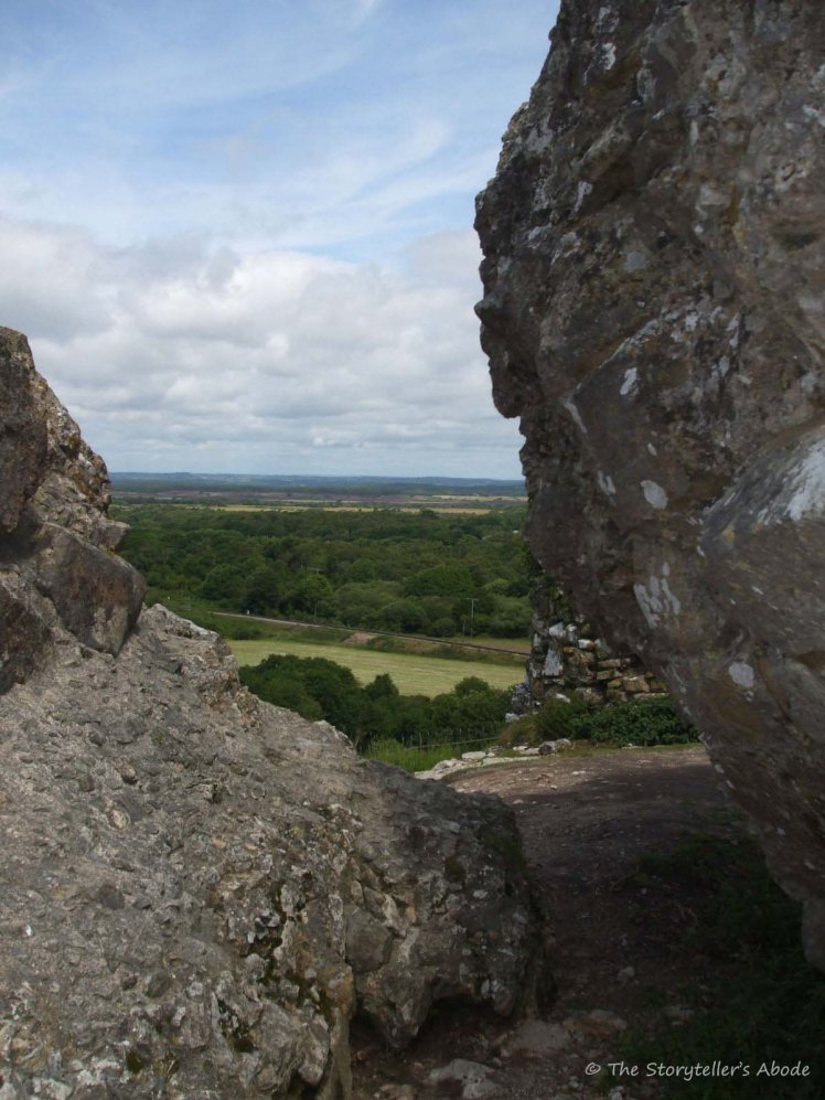
After taking August off from Robyn’s One-Four Challenge I’m now back with a new image for September. The picture I’ve chosen to edit this month was taken a few years ago at Corfe Castle in Dorset, UK, and has languished in a folder since that time. I’ve always dismissed it as being too dark but decided it would be a good one to edit. After a few minutes of playing around with it I knew I’d made the right decision..
Most of the editing for this one was done in Camera Raw, with only the crop done in Photoshop Elements 13. These are the changes made in Raw:
Temperature +10
Tint -10
Exposure +0.25
Contrast +76
Highlights -60
Shadows +60
Whites +10
Blacks +33
Clarity +100
Vibrance +10
Luminance +10
Luminance detail +100
Here’s the original image for comparison:


Big difference and so much detail and texture in the rocks, great job. Personally I would crop some of the rock off the bottom, it has a lot of visual weight but doesnt really add much to the image, its all happening at the top 🙂
LikeLiked by 1 person
I’m glad you like it and thank you for the feedback. 🙂 I’d already been thinking that I’d like to try out a few different crops for this one so I’ll try that out.
LikeLike
Great edits Louise and such a fabulous image.
You really have brought out so much detail – what you would see yourself.
Looking forward to your next steps 😀
LikeLiked by 1 person
The original had always been such a disappointment! I could hardly believe the difference a little playing around with it brought about. I’m very glad you like it. 🙂 Thanks for visiting.
LikeLike
You have brought out great detail, Louise
LikeLiked by 1 person
Thank you. I’m glad you like it. 🙂
LikeLiked by 1 person
What a lovely edit you achieved. It highlights the details in the rocks so much better and gives it a very pleasing feel. Can’t wait to see your other edits in future weeks.
LikeLiked by 1 person
Thank you. 🙂 I’m glad you like it. It’s a fun picture to play around with.
LikeLike
What a big difference the lightening makes. It’s so much more interesting now!
LikeLiked by 1 person
There was so much hidden in the shadows! Thanks for visiting. 🙂
LikeLike
I think the exposure was pretty good to begin with, although as with all images needing a bit of a tweak. Your first edit is good, I am not too much a fan of the strong clarity, for me the rock in the foreground feels quite smudgy due to it. I am interested to see where the picture will take you in the coming weeks.
LikeLiked by 1 person
Thank you for the feedback – it’s very appreciated. Sorry for the delay in replying. I actually thought I’d done so last week!
LikeLike
I like this image as it seems to present a wealth of possibilities. I agree that the original image was too dark and thus a bit “plain.” The edit brings out a lot of detail, perhaps even too much. I’ll be interested to see a black and white version.
LikeLike
Sorry for my delay in replying – your comment landed in spam! I’m glad you like the image. It’s an interesting one to play around with. This week’s should be quite different to last week’s high detail. 🙂 I’m thinking I might try black and white for my third edit. I’ve just done a black and white post for Cee’s challenge and I don’t want to overload on it! Thanks for visiting,
LikeLike
These are some nice edits, I like how the colors are deeper and the details are more apparent. Great job. 😀
LikeLiked by 1 person
Thank you, Nic. I really wanted to bring out all the detail that had been hidden in the original in this first edit. I’m glad you liked it. 🙂
LikeLiked by 1 person