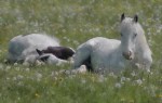
Here’s my fourth edit for Robyn’s One-Four Challenge.
For this final edit I wanted to repeat the soft, dreamy look of week 2 but with a few changes.
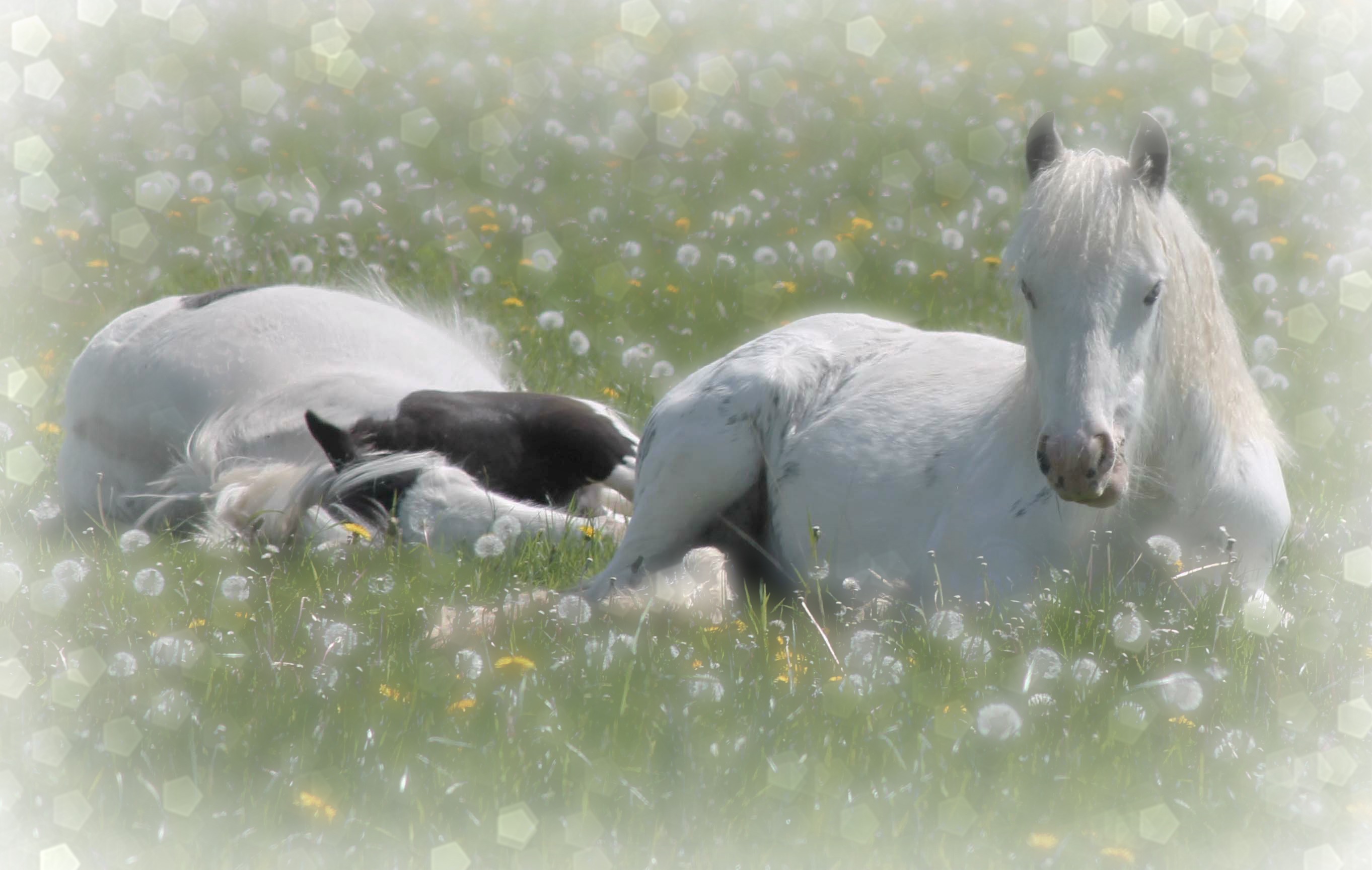
1) I selected the crop used on last weeks image.
2) I wanted to reduce the brightness of the whites on the ponies backs, an issue that had been raised in previous weeks by lensaddiction. I did this using by selecting these areas and using the levels adjustment to reduce the white output.
3) To create a softer image, I slightly lowered the midtones and reduced the contrast and saturation.
4) I imported the image into PicMonkey where I added a frost edge and some glowy bokeh.
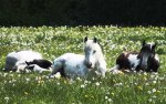
At stage 4 I also imported the image into Fotosketcher where I played around with the different artistic effects – I rather liked the watercolour effect so I thought I’d share that one with you as well!

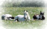
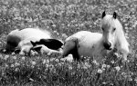
Here’s all the edits for comparison:


I like the week 4 watercolor image! You did a wonderful job on all your edits. Such beautiful horses.
LikeLiked by 1 person
Thank you! I’m glad you like it. It was a very last minute addition – I’d done it so I thought I may as well share it.:)
LikeLike
I don’t know how I missed your images this month… I really like this week’s dreamy edit. But I actually like the original too! What a cute little image of ponies! And the dandelions, one of my favorite flowers! Great job this month. 🙂
LikeLiked by 1 person
Thank you! There are so many entries into this challenge that its easy to miss people out. 🙂 I’m very glad you like it.
LikeLiked by 1 person
very lovely!!
LikeLiked by 1 person
Thank you. 🙂
LikeLike
Hi Louise, beautiful edits this week again. My favourite is dreamy, because it really is 🙂
LikeLiked by 1 person
Thank you! It’s my favourite as well – I just knew I had to revisit it with the tighter crop. 🙂
LikeLiked by 1 person
Hi Louise, yes the blown out bits are a lot better in this variation, I like the image with the bokeh tho with all the flowers and stuff I found it all a bit distracting from the point of the image which is the ponies 🙂
But the point of this challenge is to try new and exciting things and you certainly achieved that this month. I did like the much tighter crop a lot once you did that. Looking forward to next month 🙂
LikeLiked by 1 person
That was one problem I found with adding the ‘dreamy’ effect to the tighter crop. I toned down the bokeh a lot compared to week 2 but with so little space between the ponies and the edge of the picture it was bound to be distracting. 🙂 I’m glad you liked my efforts. Your advice has been invaluable over the month and I’ve learnt so much about photo editing. Thank you. 🙂
LikeLike
Sorry for the late reply, Im glad that my comments have been helpful, that is my intention, to try and help 🙂 And you have clearly been willing to experiment and try new things, and it shows in this months image, great job!
LikeLiked by 1 person
For me the winner is week three. I love the black and white tones and it works nicely with the subject.
LikeLiked by 1 person
Thanks. I’m particularly fond of week 3 as well. 🙂
LikeLike
Such a great photo to play with! I think the black and white is the most pleasing to my eye! Good job!
LikeLike
Week 3 is my favorite, but in truth you’ve done so well with ell 4 edits.
LikeLiked by 1 person
Thank you. 🙂
LikeLiked by 1 person
Ive so enjoyed watching this image evolve – it just seemed to get better each week. Just lovely, each one and nope I cant choose 😜
LikeLiked by 1 person
Thank you, Robyn. I really enjoyed playing with this image last month. I’m hoping I have just as much fun with this month’s. 🙂
LikeLiked by 1 person
Its a lovely image – i hope you do too 😃😃
LikeLiked by 1 person